(originally posted June 9, 2010) Where do you want to be in five or ten years? Do you want to die with the most toys, or do you want to die with the best life and experiences? -Tibor Kalman
In the normal course of our day we are exposed, literally, to thousands of unsolicited messages ~ in newspapers, magazines, on television, billboards and, increasingly, on the web. Whether you live in a farming community, a suburb or a metropolis, this adds up to trillions of images and voices in your ear over a lifetime. It doesn’t matter if you never succumb to any of them ~ never eat the $6 burger for $2.99, cruise the boulevard in the Ultimate Driving Machine looking for skinny jeans, or seek relief from a “serious medical condition” you innocently thought was only heartburn. For your entire life you will be exposed to a tsunami of words and images that will flood your cerebrum pretty much non-stop during your waking hours with the intent to cajole, entice, and manipulate you into believing, then buying, the entity behind the message.
Don’t kid yourself that by not paying attention or rarely succumbing you can avoid the effects of our intensely commercialized visual culture. You can’t. We are basically animals whose survival instincts keep us monitoring the horizon for the next meal or the tiger who wants to make us his next meal ~ we’re programmed not to ever fully turn off perception of our surroundings. Information we don’t need to feed ourselves or keep us safe we still have to store somewhere. ‘Tis the nature of subliminal. For all we know we're dreaming about the the blond in the Skyy Vodka ad while we sleep. (or the brunette in the Ty-D-Bowl commercial). All of which makes it pretty relevant to ask why 99% of the ubiquitous sales-motivated design that’s out there is such crap. Stupid, ugly, habitually misogynistic and, when it comes to misleading political ads (yes, they are selling something too), dangerous in the extreme. The Madison Ave mind set which went global in the 70’s, flawlessly captured in the HBO series Mad Men, has cheapened sex, twisted our notion of beauty out of all proportion, and made monitoring our frailties, instead of our strengths, a national pastime.
And yet, call me foolish, I am nevertheless fascinated by the potential of vernacular design ~ the ubiquitous signs, billboards, TV and web adverts that compose mass culture. For a start, the tools at the fingertips of both the artist and the adman are virtually the same. An ad is a Rorschach mix of words and pictures which needs to convey a message in an exceptionally condensed period of time, usually seconds, less if the image is a still one. How to do that and manage to instill a message that lingers is daunting. But the creative possibilities are endless. Or should be.
Think how much more enjoyable it would be to move through our days if only a little more talent and pride was focused on delivering messages that appealed to our critical sensibilities, instead of insulting them. Why is it then, that advertisers almost always pander to what they construe are our base instincts? The English critic Philip Toynbee called it the result of “an impoverished ability to communicate.” It’s not an impoverishment relegated to the advertising industry alone. But in their role as a major contributing factor to the crass stupidity everywhere that is demoralizing us as a culture, it’s a medium which provides a perfect Petri dish for study.
When I asked ten people why they thought the advertising industry was so insidiously bad, seven of them said it was the nature of the beast to appeal to the “lowest common dominator.” I’ve used that excuse myself in the past, but while it may make us feel superior (surely they didn’t intend that annoying Aflac duck to appeal to moi) it really isn’t a helpful answer. There is nothing wrong with finding common denominators in our culture ~ correct me if I’m wrong ~ but isn’t that the basis of democracy? It’s the fact they always seem to stoop to the “lowest” level to find them that’s worth challenging.
Unlike a painting in a museum, where you can linger over brushstrokes, or the two hours you spend getting to know the characters in a movie, the ‘art’ in an advert doesn’t have time or much space to tell a complete story, it has to imply one. Because of this, whether or not we are aware of it, we are all masters of a curious form of sub-text. When an ad nails sub-text, whether it does so through humorous or dramatic means, we take notice.
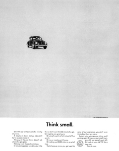
Famous case in point: with its “Think Small” campaign for Volkswagens in the 60’s, the ad agency hired by VW was faced with finding a way to sell an odd, ugly looking car, made in a former Nazi plant, that was half the size ~ with none of the bells and whistles ~ of any automobile then on American roads. The agency, Doyle, Dane & Bernbach, choose to define their product in a stark but humorous, refreshingly honest fashion. The sub-text of “Think Small” was “utility,” and the public not only got and liked the message, it bought the car by the millions. In one great design stroke a single ad campaign arguably changed automotive history.
Volkswagen took a risk because they had to. But more to the point, they delivered what the ad implied. If we rarely see this combination of creativity and truth in advertising in the products being sold, we ~ the common dominators ~ have only ourselves to blame. We vote with our wallets.
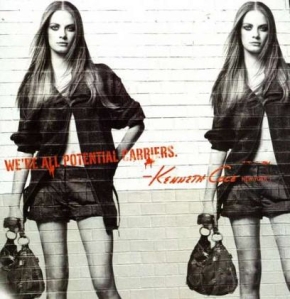
Starting In the 1980’s, Ben and Jerry’s Ice Cream, Paul Newman’s Own and Kenneth Cole devoted untold advertising dollars to promote social and environmental change. That they were able to do this while simultaneously increasing their bottom line was accepted (and respected) by their public as sustainable business models. That those companies were willing to make the connection between product and producer only worked in the long run because the products themselves were good, so even after being seduced by the come-on, we continued to buy them. Of course we don't have to limit ourselves to only buying products from companies that care about the long term well-being of their constituencies. I don't really know the deeper social agenda of Steve Jobs or Mac; from the beginning they have mounted ad campaigns which have accurately, cleverly, and often powerfully positioned products which deliver what they promise, thus ensuring a growing family of users over time.
I’m aware, of course, that many bad companies have great design. Nike comes to mind and you can think of dozens more. Differentiating the line between eye candy and visual porn, while rejecting useless corporate sites, marketing drivel and meaningless design is ultimately up to us, the consumer. Get rid of the product and you get rid of the need to sell it.
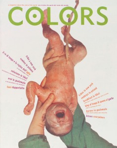
One of my favorite adman savants of all time was a curious fellow by the name of Tibor Kalman. Irreverent and often profane, Tibor eschewed a career in PR which might have afforded him “a good opportunity, a nice career, a chance to make a killing,” for one that “affects people’s lives and affects people’s brains.” Diagnosed with cancer in the 90’s, his response was to move to Italy to work with Oliviero Toscani on a series of controversial print advertisements for the huge clothing company Benetton. Together, with Benetton’s money, they went on to create the groundbreaking design magazine “Colors,” which many feel set the bar for cutting edge design with a pertinent social message.
Both Kalman and Toscani believed advertising had a creative responsibility, but they clearly understood the difference between their medium and fine art: they didn’t espouse an elitist approach. Both sought to rethink the relationship between the commercial and civic realms, both grappled with how best to serve the demands of business while raising the bar on artistic expression. For Tibor it was about “the struggle between individuals with jagged passion in their work and today’s faceless corporate committees, which claim to understand the needs of the mass audience, and are removing the idiosyncrasies, polishing the jags, creating a thought-free, passion-free, cultural mush that will not be hated nor loved by anyone.”
Toscani believed his responsibility as a designer extended beyond any one product to the nature of a medium itself, which he felt spoke a universal language. “The globalism of sales is not a bad thing to be avoided. It’s a blessing. Proclaiming that McDonalds is bad and should be banned is like saying you’re against photography because you’ve seen an ugly picture somewhere. You know what you should do? Take a better picture. THAT is revolution ~ not screaming in the streets.”
With the growing increase of ads on the internet ~ where it seems we will be spending the twilight of our civilization ~ it behooves us to take another look at why, with what IB Singer called “souls starving for oxygen,” we aren’t angrier and more vocal at companies trading in the public forum, companies we never invited into our lives in the first place, who clutter the visual landscape, insulting our intelligence while boring the hell out us. Talk about adding insult to injury.
We have, after all, the ultimate power in this design game that wallpapers our lives. All it will take is a little chutzpa. The first step is to throw down the gauntlet and say: We’ll only consider your product if you stop talking down to us. Amuse us, educate us, empower us, or get the hell out of our lives. For those companies with good products to sell, this should not be a stretch. And who knows, it may well be a start back toward influencing what is produced in the first place. Wouldn’t it be something if the proliferation of crap in the world slowed, simply because, before being manufactured, somebody at the top was forced to frame the question: “How are we going to sell this? The public’s not stupid, you know.”
Links: Annie Leonard is the bomb. The Story of Bottled Water is not simply a pithy expose on how we have come to be a nation that buys a commodity that should be free, it’s a neat way to understand how messages are disseminated in our culture. Show this one to your kids. The Story of Stuff The Story of Stuff Project
 Check out Tibor Kalman's Perverse Optimist next time you are in the bookstore.
It’s worth owning if only to read the “F____Committees. I Believe in Lunatics essay.
Perverse Optimist: Tibor Kalman Princeton Architectural Press
Kenneth Cole's Spring 2010 collection on You Tube is interesting.
Local Talent with a Long Reach:
Tod Brilliant is a wonderful PR guy with more than a little Tibor in him, who lives right here in Healdsburg. In addition to his own design work, two years ago he created a national design collaborative. Check them both out. http://www.todbrilliant.com http://www.creativejobagency.com
 Chris Blum is a local legend who has designed the logos and packaging campaigns of many products you may use daily like Thanksgiving Coffee and Rosie Free Range Chicken. One of his best designs (in our humble opinion) is the one he did for Barndiva Tractor Bar. Thanks Chris!


